I have always been interested in the ways in which we as humans express our conscious and unconscious feelings through our body movement. The way our bodies literally translate our feelings is very interesting. We hold ourselves when we are scared or uncomfortable. We lean towards those we love. We point our feet towards those we are interested in. Open or closed postures inviting or rejected social situations. Touching/covering the face signifies lying. This could be interesting to combine with the inspiration from Robert Longo's work. Constructing croque's bodies with psychologically inspired body language.
What I really like about his work is, first of all his technique. I like the idea of lightboxes. He uses them gracefully, and not in a tacky way. I feel like there is a sensitivity to his work- even though he he physically puncturing these models. I like feminity behind it, and his use of a stippling effect.
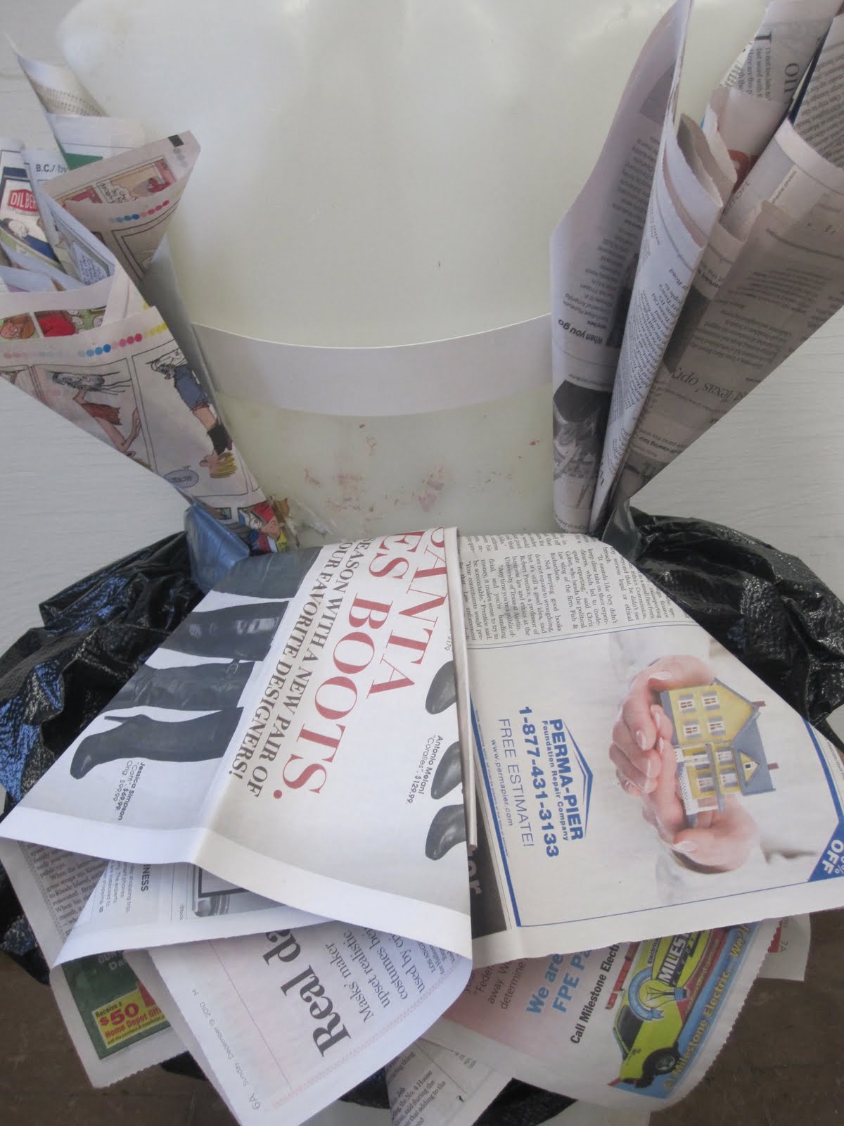
Creating clothing out of materials other than fabric is something I have had increasing interest in. I have had some experience- two dresses. One dress made of fashion magazine clippings and another made of garbage bags, newspaper, duct tape, and tissue paper. This art form has gotten increasingly popular recently, including many designers trying it out, and fashion shows dedicated to this type of fashion.
For many of the same reasons that I love the Gran Marnier commercial, I also love the Chrystler commercial. Although they are not exactly similar, they posses some of the same notions about vintage and nostalgic aesthetics. I really love the way that this commericial plays with montage, and their use of short but very effective shots. I love the subject matter and the style of the entire commercial.
For me, this commercial has several appeals to it that I can relate back to my own work. I really enjoy the colors and overall aesthetic of the piece, the colors are bright and hold some sort of glamourous and almost vintage look to it. I love the high contrast of a warm red, orange, or yellow combined with a black or white. These colors quote a more 50's and 60's vibe. Also, the commercial has a European or foreign energy to it, creating an even more glamourous aesthetic that many Americans fantasize about when thinking of foreign countries. I admire the overall aesthetic of the animation. Another reason why I enjoy this commercial is for the narrative within it, it is clever and catchy. It has an A-B-A storyline- at the beginning of the commercial it starts with someone picking up the bottle of Gran Marnier off the waiter's platter, and ends with the bottle being placed back on the platter. I enjoy the transitions between scenes and the montage effects that they use for transitioning.
Leigh Viner's art work is a true inspiration for my work. Her style combines fine art with high fashion. Techniques I admire most about her work are the use of manual tools such as paint, pastel, pencil and pen and then altering then images in a technology based forum such as Adobe Photoshop and Illustrator.